Adapting Illustrations to Dark Mode
August 15, 2023
I want to share with you a quick way to make illustrations on your website work in both light and dark mode:
.dark .invert-on-dark {
  filter: invert(1) hue-rotate(180deg);
}
Try it!
Toggle dark mode in the navigation bar and see the cover photo switch colors.
How it works
Intuitively, you want to swap black for white, white for black. For colors, you want to swap lighter colors for darker colors and vice versa.
invert(1)
Using invert(1) from the CSS Filter Effects, you can invert the colors:
.dark .invert-on-dark {
  filter: invert(1);
}
After inversion, light parts of the image appear dark and vice versa.
Unfortunately, colors are reversed too: red becomes cyan, green becomes pink, blue becomes yellow, … You don’t want this!

To understand why, let’s look at what the invert(1) function does:
function invert({ r, g, b }) {
  return {
    r: 255 - r,
    g: 255 - g,
    b: 255 - b
  };
}
The invert function operates in the RGB color space. First, the color is broken up into its Red, Green and Blue components. Then, each value is subtracted from the maximum possible value, 255.
We can do the math to see the color flipping in action:
invert({ r: 0, g: 0, b: 0 }) // black
-> { r: 255, g: 255, b: 255 } // white
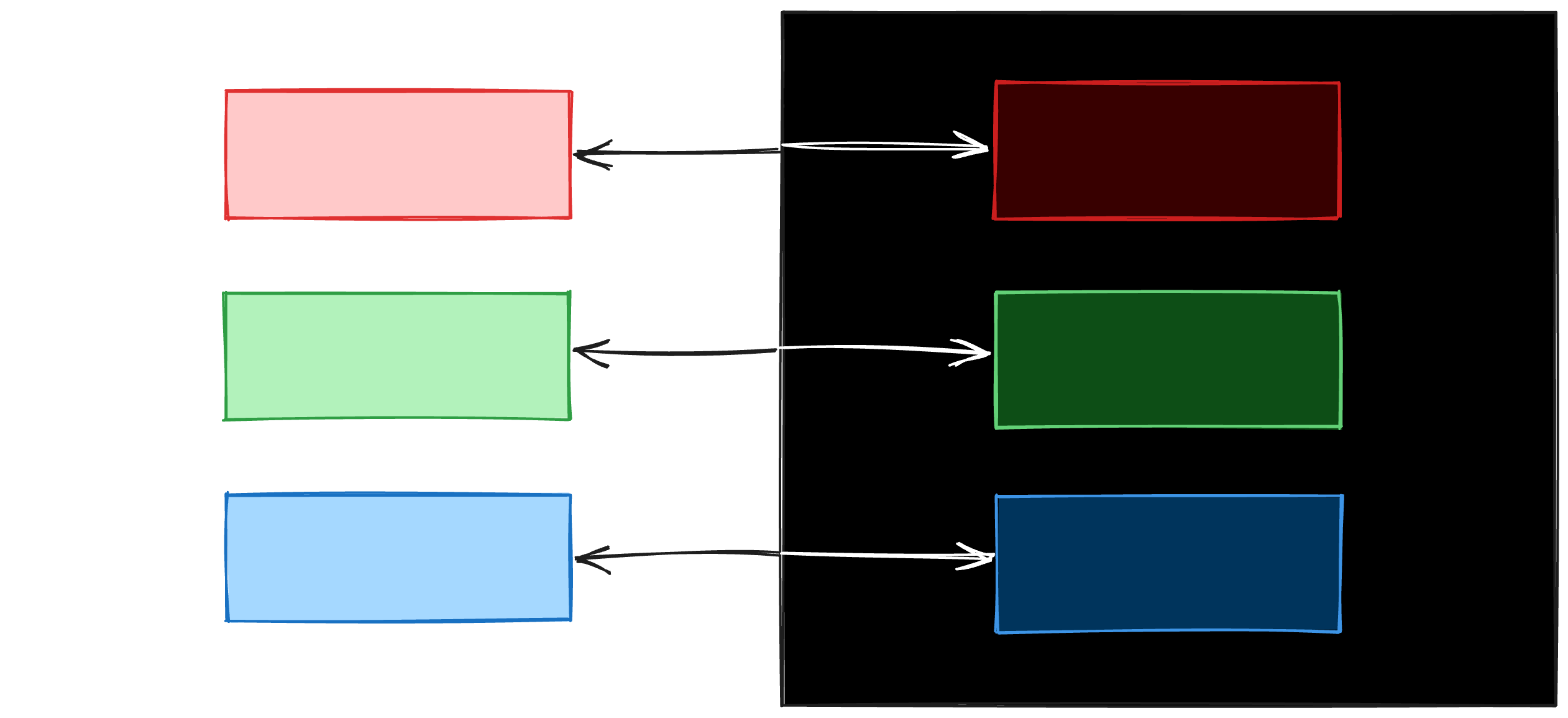
invert({ r: 0, g: 255, b: 0 }) // green
-> { r: 255, g: 0, b: 255 } // pinkFor every color, its complimentary color is returned. When inverting for dark mode, we’re aiming for a color palette that retains the original’s intent. We need a different solution.
It’s hard to intuitively express what you want using the RGB color space. Let’s look at an alternative color space, HSL.
HSL
HSL is an alternative way of representing color using Hue, Saturation, Lightness.
If you’re unfamiliar with HSL, I strongly recommend you check out hslpicker.com to get a feel for each dimension.
Can we express the invert function from the previous section using HSL? If you think about it, invert(1) inverts the lightness and also inverts the hue of your color:
function invert({ h, s, l }) {
  return {
    h: h + 180deg,
    s: s,
    l: 100% - l,
}
(Hue in HSL is measured in degrees. Rotate hue by 360 degrees and you get the exact same color. Rotate hue by 180 degrees and you get the complimentary color.)
What you want to achieve is to only invert the lightness:
function invertLightness({ h, s, l }) {
  return {
    h: h,
    s: s,
    l: 100% - l
  };
}
Unfortunately, CSS does not have an invert-lightness function. Is there another way?
hue-rotate(180deg)
hue-rotate() is a CSS filter function that rotates the hue of colors.
💡 The key insight:
invert(1)not only inverts the lightness but also rotates the hue by 180°. A subsequenthue-rotate(180deg)undoes this hue rotation.
.dark .invert-on-dark {
  filter: invert(1) hue-rotate(180deg); // inverts lightness
}
Closing notes
This is not perfect! The effectiveness of color inversion techniques largely depends on the initial color palette of the design. For some color schemes, inversion might not yield aesthetically pleasing results. You also generally will want to exclude Logos and photos from any modifications.
Nevertheless, it has worked well for a surprising number of illustrations of mine and is a handy trick to have in your tool belt.